
Struggles with Bokeh
Wanting to take a short break from the machine learning projects I’d been working on the past few months, I thought I’d work on a small visualization project for a week before getting back to it. The project itself was to create an interactive dashboard to visualize 311 calls in NYC using bokeh, an interactive visualization library in Python. At this point I’d worked a lot with static visualization libraries like matplotlib and seaborn, and wanted to explore what it takes to use code to create dashboards that are usually created in visualization software like Tableau, Looker, Power BI, etc. The answer I found: tedious as hell.
The dashboard I created visualizes call volume by dimensions like geographic location, agency name, complaint type, time of day, day of week, and call status. You can see the dashboard, the code, and run your own version of the dashboard here. It serves as a proof-of-concept for how simple analytics can help state agencies allocate resources and better prioritize cases based on urgency and importance.
Realizing that the project was taking much longer than expected but not being able to put a finger on exactly why, I decided to write down my obstacles in pursuit of 1) better understanding the gaps in my own technical knowledge, 2) getting feedback from others on the issues I ran into, and 3) saving you some tears if you one day decide to work with bokeh.
Opaque Documentation
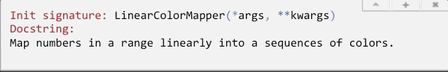
The first aspect of the library I had trouble with was the documentation. I found it strange that almost every object in bokeh has the function signature (*args, **kwargs). As someone who uses Jupyter notebook’s shift+tab functionality like every 10 seconds to look up the arguments of whatever function I’m using, this was some surprisingly opaque and unhelpful documentation.
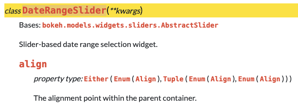
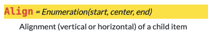
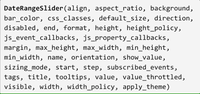
Of course, you can always go to the online documentation to get more details about each object. But even then, I found myself having a hard time understanding what seemingly straightforward objects needed as inputs. Take this DateRangeSlider object, for example - its first keyword argument is align. The definition of align is The alignment point within the parent container. Okay, I don’t know what that means, so I follow the links in the property type description to find the definition of the Align object. Documentation for the Align object is Enumeration(start, center, end). But I still don’t know what start, center, and end are, and no further explanation on those elements are available. I found myself running into rabbit holes like this over and over again. Are they numeric values? If so, what are the values in respect to? The number of pixels from the top of the page? Or is it in inches? Pls advise.
Widgets: Customization without Intuition
Widgets are bokeh’s interactive controls that enable users to play with the front-end of the visualization by changing the data powering the graph itself. This is similar to adding filters in Tableau, where users can change things like the time period, the categories being displayed, and the number of data points being displayed. Once coded and displayed correctly on the dashboard, they are simple, intuitive, and user-friendly. But in construction, not so much.
This is perhaps best illustrated with another example. The DateRangeSlider widget, which allows users to select the range of dates to display in the visualization, has the following signature:
Almost forty parameters…to create an object that looks like this:
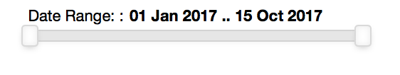
And yet, none of these parameters allow you to change the label of the slider (from “Date Range:” to something else), the format of the dates shown, the text font, the text size, or the step size (select date by day, week, month, etc). These are all basic and intuitive aspects of what should be user-determined in a visualization library with this much customization. I ran into similar patterns in object structure with most of the widgets I used, finding them to be overly customizable in some areas and lacking basic functionality in others.
Visual Dynamics
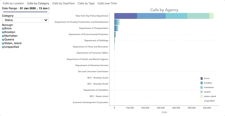
It’s nice that bokeh enables you to create graphs that change with user inputs. It’s less nice that while you can code in functionality to dynamically update (i.e. use a filter to change values) the underlying dataset powering the graph, you cannot update corresponding important visual elements of the graph like axes labels and tick marks. This results in a visualization where the values being displayed change, and the meaning of the values themselves change (instead of viewing different agencies, we are now viewing different zip codes, or different call statuses), but the axes labels do not reflect that. These kinds of errors, if overlooked, result in graphs that are misleading and just…incorrect. In the graph below, we change the category from Agency to Descriptor, Location Type, and Zip Code, but the axes labels are “stuck” on displaying only agency names. This is possible to update in CSS or JS, but not in bokeh.
My gut says that if there is a data source object (called ColumnDataSource) that allows you to change the data source, it is possible to have an axes object with axes labels and tick marks that can change with the data source. The same could be said of the chart title and chart legend, critical visual elements of a graph that often change in meaning when the underlying data changes.
Cumbersome Iteration
Okay, last one. Iteration in bokeh is cumbersome and unforgiving. I didn’t realize this at first, but to get widgets to actually work with the visualization (as in, update your graph), you have to run your script through bokeh server with the following command:

That runs the script from top-to-bottom, which in my case entails downloading data from the NYC Open Data API, cleaning it, and re-creating each bokeh tab (each tab has one graph) from scratch. From beginning to end, the process takes about five minutes. That doesn’t sound long, but consider running this process every time you want to test a small tweak in formatting (changing the color of a data point, the font of a label) or the addition of a new widget to your dashboard. Because widgets don’t work directly in a Jupyter Notebook, where you can run code cell-by-cell, the ability the iterate and test new code goes from 100 to 0 real quick.
Okay, that’s it. I would love to hear if anyone’s been able to find their way around these obstacles with bokeh, or knows of any good alternatives for interactive visualization in Python. A few people have mentioned streamlit to me, a library for data scientists to easily build sleek, simple apps. Maybe I’ll try that next. But for now, let’s take a break from bokeh.